Putting the 'role' back in role-playing games since 2002.
Donate to Codex
Good Old Games
  • Welcome to rpgcodex.net, a site dedicated to discussing computer based role-playing games in a free and open fashion. We're less strict than other forums, but please refer to the rules.

    "This message is awaiting moderator approval": All new users must pass through our moderation queue before they will be able to post normally. Until your account has "passed" your posts will only be visible to yourself (and moderators) until they are approved. Give us a week to get around to approving / deleting / ignoring your mundane opinion on crap before hassling us about it. Once you have passed the moderation period (think of it as a test), you will be able to post normally, just like all the other retards.

Incline What are you working on?

Cleveland Mark Blakemore

Golden Era Games
Übermensch Developer
Joined
Apr 22, 2008
Messages
11,610
Location
LAND OF THE FREE & HOME OF THE BRAVE
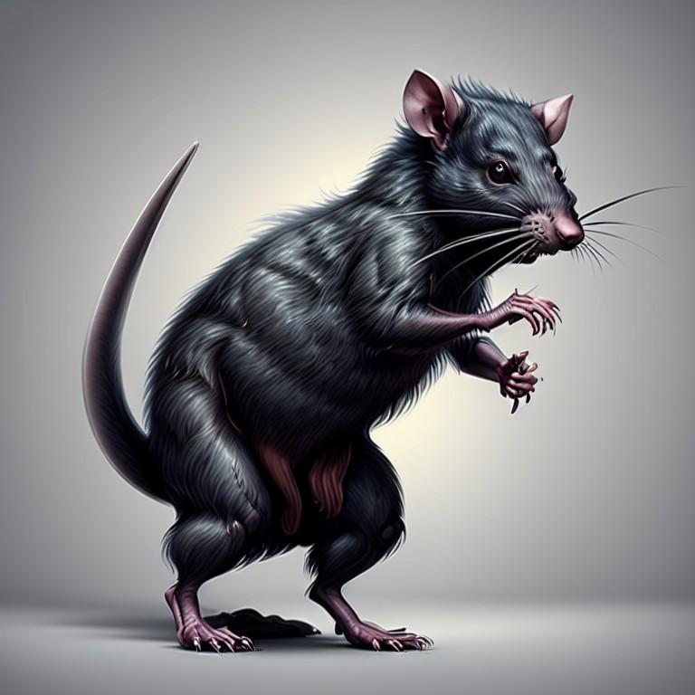
Got a whole new look for the portraits and settings that was far more 1920's retro ... then realized all my Lovecraft monsters were now so cartoonish and gay they ruined the entire artistic style.

So I went back to my training program to match the new style and I found that I can add a bit of IK animation to any creature I create using a Unity tool called Puppet 2D. Starting with the static output of the AI and a bit of fudging, the monsters are now more lifelike and maybe I will add an attack and hurt animation to each as well.

This is the sort of monster below I have gotten out of the generator, it matches the more realistic style and the dark horror feel a lot better. With the addition of blood splashes or ichor splashes the hits are looking cooler too. Really coming together to look AAA. I had to go in and switch to new portrait frames and UI as well to match everything else.

All using Fudge RPG math, working pretty good.

lovecraft_monster_05.jpg
 
Self-Ejected

Dadd

Self-Ejected
Joined
Aug 20, 2022
Messages
2,727
There were two characters that looked like that. But I'm not sure if you could skip them.
 

luj1

You're all shills
Vatnik
Joined
Jan 2, 2016
Messages
13,741
Location
Eastern block
Weaboo anime stuff like this is out of place in Grimoire. It doesn't match the rest of the game which has 'western fantasy' written all over.
 

Butter

Arcane
Patron
Joined
Oct 1, 2018
Messages
7,833
The only Sir-Tech product that leans into anime aesthetics at all is the appalling Wizardry Gold, and even then it's only with the butchered character portraits. It wasn't until the Japs bought the franchise that it really went out of control.


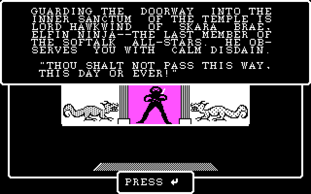
This video shows a character portrait that was clearly intended for ninjas, and it's not remotely anime. It also shows the Gorn, an apparently East Asian-influenced race, who nevertheless show no signs of anime influence.


Here's what a ninja looks like in Wizardry IV (note the lack of anime influence again):

Z2lm.gif
 

ShaggyMoose

Savant
Joined
Aug 26, 2017
Messages
596
Location
Australia
If you are into lovecraftian setting use midjourney its more advanced than anything else so far in my opinion, does that and post apoc really good... just have to photoshop a few bits to correct some imperfections.
Yeah, like the fact that the table has no fucking legs?! Actually, the cake looks like it's hovering too so can't tell whether its all part of the same intent, or just plain broken.
 

Cleveland Mark Blakemore

Golden Era Games
Übermensch Developer
Joined
Apr 22, 2008
Messages
11,610
Location
LAND OF THE FREE & HOME OF THE BRAVE
The only Sir-Tech product that leans into anime aesthetics at all is the appalling Wizardry Gold, and even then it's only with the butchered character portraits. It wasn't until the Japs bought the franchise that it really went out of control.

Just got Wiz Gold installed from GOG on my new machine and had forgotten what a travesty of style it was. Had to be Brenda's doing. They marred the legacy of Wiz 7 with their childish desecration of it's beautiful 8-bit artwork. Turned it into a weaboo graffiti wall.

I think they used maybe 6 colors altogether in their redo of the portraits and they look so juvenile it is embarrassing, straight out of Sailor Moon. They also mutilated nearly every aspect of the original.

Did not "release" anything deserving of mention for next 10 years while they burned through their capital and destroyed their own IP. Wiz 8 junk was only crapped out into a safety diaper after they went bankrupt. Lose, fail and lose again.

P.S. Those original W7 portraits are so good. I think they are 48x48 pixels at 256 colors. They are amazing, have shadow and rimlights and all clearly hand drawn.
 
Last edited:

As an Amazon Associate, rpgcodex.net earns from qualifying purchases.
Back
Top Bottom